
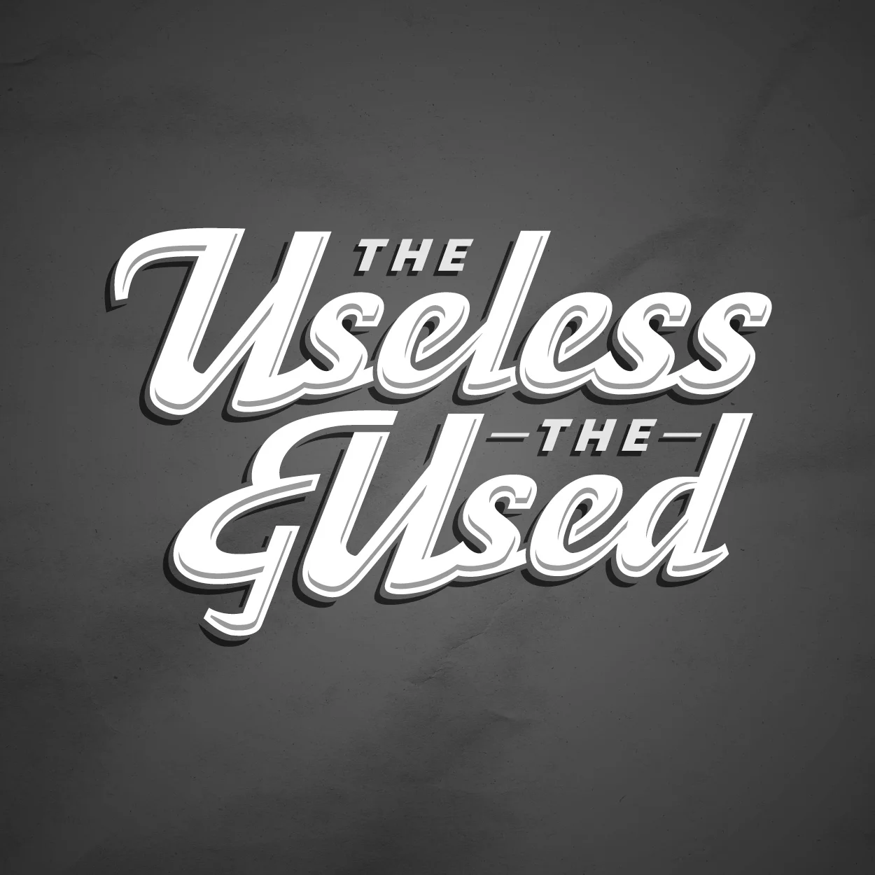

A type treatment and monogram mark created for a vintage brand that believes in an 80s punk DIY attitude.
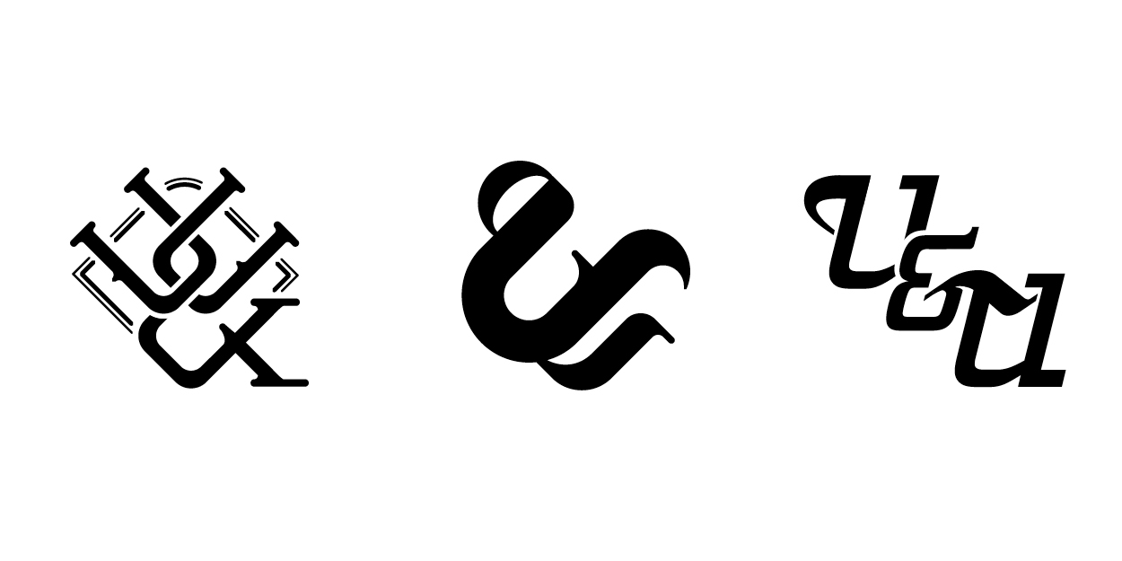
While the full type treatment lent itself nicely to the front of a tee-shirt, there was still a need for a ball cap design to promote their embroidery skills. This is where the concept of the ampersand came to life using two letter U’s to compose the form.